The New Era of Colour Chaos: Why Designers Are Breaking the Rules
2025 has brought a refreshing rebellion to the world of graphic design. Gone are the days of muted tones, pastel palettes, and minimalist monotony. Designers today are embracing a wave of colour chaos- a visual explosion defined by heat-map style gradients and mismatched colour combinations that defy convention yet demand attention.
From social media campaigns to product packaging, the modern eye craves energy, emotion, and unpredictability- and this trend delivers all three in vibrant measure.
What Are Heat-map Style Gradients?
If you’ve seen weather maps or thermal scans, you already know what this looks like- bright, shifting hues moving from deep reds to hot yellows, to cool blues and purples. Designers have borrowed this visual language and turned it into an art form.
Heat-map style gradients use intense colour transitions to simulate energy and motion. They visually communicate temperature, mood, and dynamism. Unlike traditional linear or radial gradients, these have no soft harmony- they’re bold, high-contrast, and intentionally loud.
💡 Why it works:
- Evokes energy and activity, perfect for tech, sports, or youth-centric brands.
- Adds a dimensional feel, even in flat designs.
- Works beautifully in digital interfaces, motion graphics, and branding visuals.
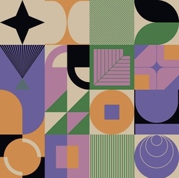
Mismatched Colours: Imperfect Harmony for Modern Design
Design has always taught us to follow the rules of colour theory- complementary hues, tonal balance, visual calm. But 2025’s aesthetic thrives on disruption.
Mismatched colours- think magenta with olive green, violet with mustard, or cyan with brick red , are being used deliberately to grab attention and convey authenticity. These pairings feel raw, human, and instinctive, reflecting the imperfection and individuality of our times.
Today’s audiences respond emotionally to contrast. They associate mismatched palettes with creativity, honesty, and non-conformity, values that brands increasingly wish to project.
The Psychology Behind Bold Colour Choices
Every colour triggers emotion , but when colours clash, they create emotional tension. This is what gives heat-map and mismatched palettes their impact.
- Red + Blue: conflict and balance, dynamic duality.
- Orange + Purple: energy meets mystery, creative tension.
- Neon + Neutral: contrast between chaos and calm, eye-catching yet elegant.
This emotional layering makes mismatched palettes powerful tools in brand storytelling, allowing designers to visually express personality and mood without words.
The Influence of Digital Culture and AI Tools
The rise of AI-generated art and digital experimentation has turbocharged this trend. Tools like Midjourney, DALL·E, and Runway are breaking visual boundaries, allowing creators to test colour combinations once considered “impossible.”
The result? A new visual vocabulary, one that merges tech aesthetics with emotional storytelling. Designers are now comfortable blending neon warmths with cyber cools, creating futuristic heat-map textures that feel both digital and deeply human.
Balancing the Chaos: When and How to Use It
Like any bold visual tool, the magic lies in moderation and intent. Overuse can overwhelm the viewer, but a strategic splash can elevate an entire design.
Pro Tips for Designers:
- Pair intense gradients with clean typography or white space.
- Use mismatched colours in hero areas, not across entire layouts.
- Ensure accessibility, contrast should enhance, not obscure.
- Test palettes on multiple screens to check for colour distortion.
Real-World Examples Leading the Trend
- Spotify Wrapped 2024: Bright gradient explosions symbolizing the diversity of global sound.
- Adobe MAX Visuals: Electric mismatched hues representing creative freedom.
- Nike Digital Campaigns: Heat-map overlays reflecting energy and motion.
- Modern Art Posters: Combining warm-neon palettes with bold typographic contrasts.
Each example shows how brands are using colour not as decoration but as identity.
Future of Colour in Design: Emotional Intelligence Meets Technology
The next step in this evolution? Emotionally adaptive colour systems. With AI-driven interfaces that respond to user mood or environment, heat-map gradients might become dynamic, shifting in real time based on engagement.
Imagine a website background that subtly changes hue as a viewer interacts, visually mirroring their emotional response. That’s where colour meets consciousness.
Conclusion: Designing with Intention, Not Just Attention
Heat-map style gradients and mismatched colours are more than passing fads, they’re part of a broader movement toward emotional authenticity and sensory storytelling in design.
As boundaries blur between technology and art, these bold visual languages remind us that design is not just about what looks good, it’s about what feels alive.
So, whether you’re a graphic designer, brand strategist, or digital artist, remember:
Colour is not chaos. It’s communication, in its most electric form.